
8 Stunning Crochet Color Combinations to Try in 2025
The right colors can transform a simple crochet project into a work of art, but choosing the perfect yarn hues can feel overwhelming. Color theory isn’t just for painters; it’s a powerful tool for every crocheter. Understanding how colors interact, whether creating harmony with analogous shades or making a bold statement with contrasting tones, is the secret to breathtaking results. This is where mastering crochet color combinations becomes essential.
In this guide, we’ll move beyond guesswork and dive into curated, stunning palettes, complete with project ideas and practical tips. We will explore why certain palettes work so well together, giving you the confidence to select colors for everything from cozy blankets to stylish garments and home decor. You’ll gain a practical understanding of color relationships that you can apply to any future project. This isn’t just about picking colors you like; it’s about learning how to combine them to create a specific mood, highlight intricate stitchwork, and ensure your finished piece looks polished and intentional.
Whether you’re a beginner intimidated by the yarn aisle or an experienced crafter looking for fresh inspiration, this list is your new resource. Get ready to elevate your creations with palettes that truly pop and turn your next project into a masterpiece. Let’s explore the combinations that will bring your stitches to life.
1. Classic Navy and Cream: Timeless Elegance
The enduring appeal of navy and cream lies in its sophisticated simplicity. This high-contrast pairing creates clean, crisp lines that feel both classic and modern. Drawing inspiration from nautical fashion and traditional Aran sweaters, this combination offers a refined aesthetic that elevates any project. It’s one of the most reliable crochet color combinations for creating pieces with timeless style. It speaks of quiet confidence and effortless grace, making it a go-to for projects that need to feel both luxurious and approachable.
The deep, rich navy provides a strong, grounding base, while the soft cream or off-white adds a touch of light and warmth. This balance makes it incredibly versatile, suitable for everything from cozy home decor to chic, wearable garments. The visual clarity of this duo is perfect for showcasing intricate stitch work and structured patterns, as the contrast ensures no detail is lost. It’s a palette that never goes out of style, guaranteeing your handmade items will be cherished for years to come.
Why It Works So Well
The magic of navy and cream is its ability to be both bold and understated. The strong value contrast (a very dark color next to a very light one) is inherently eye-catching, making simple stripes or color blocks look intentional and well-designed. This pairing feels familiar and comforting, evoking images of seaside retreats and classic American sportswear, which adds a layer of sophisticated nostalgia to your work. Psychologically, navy is associated with stability and calm, while cream suggests warmth and ease, creating a perfectly balanced emotional tone for your projects.
Actionable Tips for Implementation
- Vary Your Dominant Color: For a bright, airy feel, use cream as your main color with navy accents. For a bolder, more dramatic look, make navy the star and use cream for details like cuffs, collars, or stripes. This simple decision can completely change the mood of the final piece.
- Emphasize Texture: The simplicity of this palette allows texture to shine. Use stitches like the alpine stitch, bobbles, or cables to add depth and interest without overwhelming the design. The high contrast between the two colors will beautifully highlight the shadows and highlights created by these textured stitches.
- Strategic Colorwork: This high-contrast combo is ideal for colorwork techniques. It creates sharp, clear motifs in Fair Isle, tapestry crochet, and mosaic patterns. The distinct colors ensure your intricate designs are easily visible and appreciated from a distance. Consider a classic checkered or houndstooth pattern for a truly striking effect.
Best Projects for This Palette
This combination excels in projects that aim for a classic or elegant finish. Consider a nautical-themed throw blanket with bold navy and cream stripes for a coastal-inspired living room. A classic cardigan in this palette is a wardrobe staple that can be dressed up for business casual settings or down for a weekend outing. It’s also a go-to for baby blankets, offering a sophisticated alternative to typical pastels that parents will appreciate for its timeless appeal and ability to match any nursery decor.
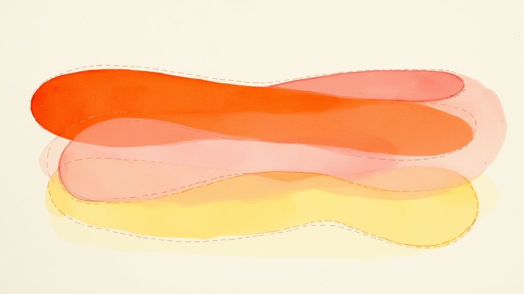
2. Sunset Gradient: Vibrant and Energizing Warmth
Capturing the breathtaking beauty of a twilight sky, the sunset gradient combines fiery oranges, soft pinks, and warm yellows to create a visually stunning effect. This analogous color scheme flows naturally from one shade to the next, mimicking the seamless color transitions seen in nature. It’s one of the most cheerful and dynamic crochet color combinations, perfect for projects that aim to be both eye-catching and comforting. It brings an infectious optimism to any item, making it impossible to ignore.
The combination of deep orange, vibrant coral pink, and sunny yellow creates a palette that radiates energy and positivity. This trio works together harmoniously because the colors sit next to each other on the color wheel, ensuring a smooth and pleasing visual flow. This makes it an excellent choice for statement pieces that bring warmth and a bohemian flair to home decor or personal accessories. The colors themselves are associated with joy, creativity, and enthusiasm, infusing your work with an emotional depth that goes beyond aesthetics.
Why It Works So Well
The magic of a sunset gradient lies in its emotional impact and natural harmony. These warm tones are inherently uplifting and associated with happiness, energy, and comfort. The gradual shift from a bright yellow to a deep orange creates a sense of movement and depth, drawing the eye across the project. This makes it particularly effective for larger items like blankets and shawls where the full gradient can be displayed, allowing the colors to melt into one another and tell a visual story of a day coming to a beautiful close.
Actionable Tips for Implementation
- Plan Your Transition: To achieve a smooth gradient, plan how your colors will flow. Start with the lightest color (yellow) and gradually move to pink and then orange. Using a yarn cake with long color changes is an easy way to achieve this effect effortlessly. If using separate skeins, consider techniques like marling (holding two strands together) to blend the transition zones.
- Use a Neutral Buffer: If the transition between two colors feels too abrupt, introduce a thin stripe of cream or soft white between them. This can soften the shift and add a modern touch to the classic gradient look, providing a moment of visual rest for the eye.
- Leverage Pattern Direction: This palette shines in patterns that work from one point outwards, like corner-to-corner (C2C) blankets or top-down shawls. This allows the colors to expand naturally across the fabric, enhancing the gradient effect. For those looking for an all-in-one solution, exploring a variety of crochet project kits can provide perfectly matched yarns for this palette.
Best Projects for This Palette
This vibrant combination is ideal for projects that make a bold statement. A sunset-themed throw blanket can instantly become the centerpiece of a room, bringing a burst of color and warmth. Gradient shawls and scarves are also excellent choices, as they beautifully showcase the flowing colors when draped, creating a cascade of warm hues. For home decor, consider a mandala-style wall hanging or pillow cover to add a touch of bohemian chic to your space and serve as a daily dose of sunshine.
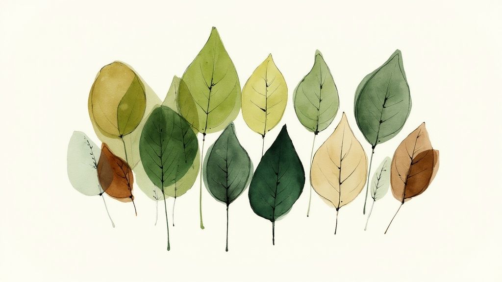
3. Forest Greens and Browns: Grounded in Nature
This earthy and organic palette brings the serene feeling of a woodland retreat directly into your hands. Combining various shades of green, from muted sage to deep forest, with complementary browns ranging from light tan to rich chocolate, this duo creates a grounding and calming effect. It’s one of the most comforting crochet color combinations, perfect for evoking the tranquility of nature and the quiet strength of the earth.
Inspired by the Scandinavian design movement and rustic cabin aesthetics, this combination feels both cozy and sophisticated. The greens provide a sense of life and renewal, while the browns offer a stable, earthy foundation. This natural harmony makes the palette incredibly versatile for projects intended to create a warm, inviting atmosphere. It’s a palette that feels authentic and connected, ideal for pieces that you want to feel both stylish and deeply comforting.
Why It Works So Well
The strength of forest greens and browns lies in their analogous relationship on the color wheel, creating a low-contrast, harmonious blend that is easy on the eyes. This palette feels inherently balanced and peaceful, mirroring the natural world. It connects us to the outdoors, making finished pieces feel comforting and authentic, which is why it’s a staple for autumn and winter projects or rustic home décor. The colors don’t shout for attention; they create a quiet, confident backdrop for life.
Actionable Tips for Implementation
- Play with Texture: When using similar tones of green and brown, texture is key to creating definition. Combine chunky stitches like the bobble or puff stitch with smoother stitches like single or double crochet to help the colors stand apart and add tactile interest. This mimics the varied textures found in a real forest.
- Introduce an Accent Color: To prevent the palette from feeling too dark or uniform, introduce a small pop of a brighter color. A thin stripe of mustard gold, rich cream, or even a surprising deep burgundy can lift the entire design and add an unexpected touch of brightness, like a wildflower on the forest floor.
- Follow the 60-30-10 Rule: For a balanced look, use a dominant green (like a medium olive) for 60% of the project, a secondary brown (like chocolate) for 30%, and a light accent (like tan or cream) for the final 10%. This design principle ensures a harmonious and professional-looking distribution of color.
Best Projects for This Palette
This combination is ideal for projects that aim for a cozy, rustic, or natural feel. A rustic afghan with stripes or a patchwork of green and brown squares is perfect for a cabin-style living room. This palette also shines in men’s sweaters and accessories like scarves and beanies, offering a masculine yet stylish look that feels connected to nature. For a charming nursery, consider woodland-themed baby items like a fox-themed blanket or a forest mobile.
4. Monochromatic Blues: Soothing Depth and Harmony
A monochromatic palette uses multiple shades of a single color, creating a design that is inherently cohesive and sophisticated. Focusing on blues, from the lightest sky or powder blue to the deepest indigo or navy, allows you to build depth and visual interest through tonal variation. This approach creates a calming, unified aesthetic that is both modern and timeless, making it one of the most elegant crochet color combinations available. It’s a masterclass in subtlety and grace.
This color scheme evokes a sense of peace and tranquility, reminiscent of a serene ocean or a vast, clear sky. By layering different tones of blue, you can guide the eye across the project, creating a subtle gradient effect without the jarring contrast of different hues. It’s a perfect choice for projects where you want texture and pattern to be the main focus, as the unified color story won’t compete with intricate stitch work, but rather enhance it through subtle shifts in light and shadow.
Why It Works So Well
The strength of a monochromatic blue scheme is its ability to be visually rich while remaining uncluttered and peaceful. The human eye finds tonal gradients naturally pleasing and easy to process, which gives these projects a professional, high-end feel. This palette is incredibly versatile, fitting seamlessly into coastal, minimalist, and even modern farmhouse decor, making it a reliable choice for items intended as gifts or for home use. The color blue is universally associated with calm, stability, and trust, making it a soothing choice for blankets and personal items.
Actionable Tips for Implementation
- Select a Range of Tones: For a dynamic look, use at least three to four distinct shades of blue. Combine a light (sky blue), a mid-tone (royal blue), and a dark (navy) to create clear separation and a beautiful gradient. Make sure there is enough difference between your chosen shades to be noticeable.
- Play with Texture: A single-color family is the perfect backdrop for textured stitches. Use puff stitches, cables, or the basketweave stitch to add dimension that the tonal shifts will beautifully highlight. The light will catch the high points of the stitches, while the shadows will deepen the darker tones.
- Create a Gradient Effect: Arrange your blues from lightest to darkest (or vice-versa) in stripes or color blocks to create an ombré effect. This is especially stunning in long projects like scarves or blankets, where the gradual change in color can be fully appreciated.
Best Projects for This Palette
This combination is ideal for creating a calming and sophisticated atmosphere. Consider a gradient or ombré baby blanket that transitions from pale powder blue to a gentle medium blue for a serene nursery accessory. A textured throw pillow using several blue tones can add a pop of sophisticated color to a neutral sofa. This palette also excels in spa-inspired accessories like washcloths and bathmats, creating a tranquil, resort-like feel in your bathroom.
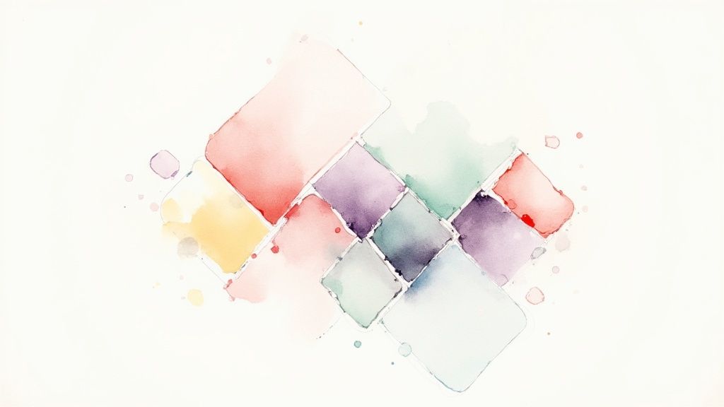
5. Jewel Tones: Emerald, Sapphire, and Amethyst
For a truly luxurious and dramatic effect, jewel tones offer an unparalleled richness. This palette, featuring the deep, saturated hues of emerald green, sapphire blue, and amethyst purple, evokes the opulence of precious gemstones. These colors work in stunning harmony due to their similar intensity and cool undertones, creating projects with a regal and sophisticated presence. This is one of those crochet color combinations that instantly adds a sense of occasion and value.
Inspired by everything from Victorian-era textiles to high-end fashion, this trio brings a powerful and emotive quality to your work. The deep sapphire provides a stable, calming base, while the vibrant emerald adds life, and the mystical amethyst introduces an element of creative flair. Together, they create a visually complex and captivating tapestry of color that feels both timeless and bold, perfect for projects you want to be treasured as heirlooms.
Why It Works So Well
The success of this combination lies in its analogous nature on the color wheel, where blue-greens, blues, and blue-violets sit near each other. This creates a cohesive and pleasing aesthetic, even with such strong individual colors. Their shared depth and saturation level ensure no single color overpowers the others, allowing them to blend beautifully in intricate patterns or stand out in bold color-blocked designs. This palette feels special and celebratory, making any project feel like a treasured heirloom. It’s a confident choice that speaks of quality and artistry.
Actionable Tips for Implementation
- Incorporate a Metallic Accent: Weave in a fine strand of gold or silver metallic thread to elevate the "jewel" quality of the palette. This adds a subtle shimmer that catches the light and enhances the luxurious feel, truly mimicking the sparkle of gemstones.
- Balance with a Neutral: To prevent the deep colors from becoming too heavy, consider using them as bold accents against a neutral backdrop like charcoal gray, black, or even a dark cream. This makes the jewel tones pop and adds a modern, graphic sensibility to the richness.
- Let the Yarn Shine: The beauty of these colors is often best displayed in yarns with a natural sheen, like silk, bamboo, or mercerized cotton. For more insight into how different fibers carry color, you can explore this personal journey through yarn types and textures on crochetcraze.com.
Best Projects for This Palette
This palette is perfect for projects that demand attention and elegance. An evening wrap or shawl made with these colors becomes a statement accessory for a formal event. They are also ideal for holiday decorations, like ornate Christmas stockings or a decorative tree skirt, bringing a sense of traditional opulence. For a special gift, a formal table runner or a set of decorative doilies in these jewel tones can add a touch of handcrafted luxury to any home.
6. Dreamy Pastels: Pink, Lavender, Mint, and Butter Yellow
This soft, gentle palette evokes a sense of sweetness, nostalgia, and lighthearted charm. The combination of baby pink, soft lavender, mint green, and butter yellow creates a dreamy, romantic aesthetic reminiscent of spring blossoms and candy shops. This collection of desaturated, low-intensity hues works harmoniously to produce a delicate and soothing effect, making it one of the most beloved crochet color combinations for projects that require a tender touch.
The magic of pastels lies in their ability to blend seamlessly without competing for attention. Each color is soft enough to act as a neutral when placed next to another, resulting in a gentle, cohesive look. This makes the palette incredibly forgiving and perfect for everything from heirloom baby gifts to cheerful home accessories that brighten a space without overwhelming it. The overall effect is light, airy, and full of gentle optimism.
Why It Works So Well
Pastels share a similar value and saturation, meaning they have a low-contrast, harmonious relationship. This creates a visually calm and unified effect that feels cheerful and optimistic. Popularized by nursery design and the shabby chic decorating movement, this palette triggers feelings of comfort, innocence, and tranquility. It’s the visual equivalent of a gentle lullaby, making your finished pieces feel cozy and safe. The lack of harsh contrast makes it exceptionally pleasing to the eye and very easy to live with.
Actionable Tips for Implementation
- Introduce a Neutral: Add stripes or borders of cream, white, or a very light grey to give the pastels a crisp background. This can prevent the colors from looking overly sweet and adds a touch of modern sophistication, framing the soft colors beautifully.
- Play with Texture: Because the colors are so soft, texture becomes a key element. Use puff stitches, bobbles, and shell stitches to create tactile interest that makes the gentle colors pop. A simple granny square project can look stunning when each round is a different pastel hue, creating a subtle patchwork effect.
- Create a Gradient Effect: Arrange your pastels in an ombre or gradient sequence for a beautiful, flowing design. This works wonderfully in blankets, shawls, and scarves, creating a soft and seamless transition from one color to the next, like a watercolor painting.
Best Projects for This Palette
This palette is the quintessential choice for nursery items. Think of a classic baby blanket made of pastel granny squares, adorable booties, or a sweet nursery wall hanging. It’s also ideal for spring-themed projects, such as a lightweight cardigan or accessories for Easter celebrations. For home decor, consider cottage-style throw pillows or a delicate table runner to add a touch of handmade charm. For those just starting out, selecting a high-quality, soft yarn is key; you can find great crochet yarn for beginners that comes in these lovely shades.
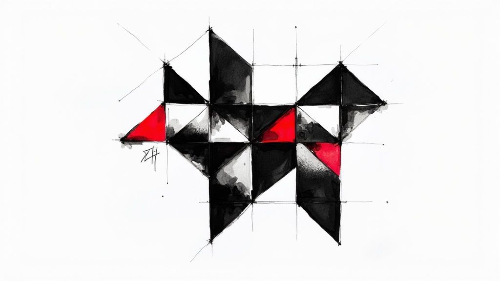
7. Black and White with a Bright Accent: Modern Graphic Impact
For a truly dramatic and contemporary statement, the high-contrast duo of black and white paired with a single, vibrant accent color is unparalleled. This approach takes a classic monochrome base and infuses it with energy and personality. Drawing inspiration from modern art, graphic design, and minimalist fashion, this is one of the most effective crochet color combinations for creating pieces that feel bold, intentional, and visually striking. It’s a palette for those who want their work to be noticed.
The powerful foundation of black and white provides a sophisticated canvas, allowing the accent color, whether a fiery red, electric turquoise, or shocking pink, to command attention. This creates an immediate focal point and a dynamic visual hierarchy. The result is a clean, graphic aesthetic that prevents busy patterns from looking chaotic while adding a deliberate splash of excitement. This controlled use of color feels both playful and polished.
Why It Works So Well
The success of this palette lies in its perfect balance of neutrality and vibrancy. Black and white offer the strongest value contrast possible, creating a visually clean and structured backdrop. The introduction of a saturated accent color injects a dose of emotion and prevents the design from feeling too stark or cold. This strategic use of color feels confident and modern, making it ideal for projects intended to be a centerpiece. It’s a clever way to use color to direct the viewer’s eye exactly where you want it.
Actionable Tips for Implementation
- Follow the 10% Rule: Use your bright accent color sparingly to maximize its impact. A good guideline is to have it make up roughly 10% of the overall design, ensuring it pops without overwhelming the piece. This could be a single stripe, the border, or small details within a pattern.
- Embrace Geometric Designs: This combination is made for geometric patterns. Think sharp chevrons, bold stripes, clean squares in tapestry crochet, or crisp mosaic designs. The defined colors will make your geometric work look exceptionally sharp and impactful.
- Choose Your Accent Wisely: The accent color sets the entire mood. A bright yellow feels playful and energetic, a deep red feels sophisticated and powerful, and a neon green feels edgy and futuristic. Pick a color that reflects the personality you want the project to have.
Best Projects for This Palette
This combination shines in modern home decor and bold accessories. A contemporary geometric afghan or a set of graphic throw pillows can instantly modernize a living space. It’s also fantastic for a statement scarf or shawl that adds a pop of color to a neutral outfit. For a truly unique and stylish gift, consider a bold baby blanket using this palette for a modern, non-traditional nursery that stands out from the crowd.
8. Autumn Harvest: Burgundy, Gold, Rust, and Cream
This palette captures the quintessential warmth and richness of the fall season. Combining deep burgundy, vibrant gold, earthy rust, and a soft cream creates a harmonious blend that feels cozy, nostalgic, and deeply comforting. Inspired by changing leaves, harvest festivals, and a crackling fireplace, these crochet color combinations are perfect for creating projects that celebrate the beauty of autumn.
The combination of both warm (gold, rust) and cool-leaning (burgundy) jewel tones grounded by a neutral cream offers incredible depth. The richness of the colors brings a sense of luxury and tradition, making it ideal for home decor that you’ll want to bring out year after year, as well as for statement garments that feel both timely and timeless. It’s a palette that wraps you in a visual hug.
Why It Works So Well
The strength of the Autumn Harvest palette is its analogous nature, with burgundy, rust, and gold sitting near each other on the color wheel. This creates a naturally pleasing and cohesive look. The cream acts as a crucial balancing element, providing a neutral space that prevents the rich colors from becoming overwhelming and allows each one to stand out. This palette evokes a strong emotional connection to comfort, family gatherings, and the cozy transition into winter, making it powerfully nostalgic and inviting.
Actionable Tips for Implementation
- Balance with Cream: Use cream as a separator in striped patterns or as the background color in colorwork. This will make the richer colors pop and give the overall design a clean, organized feel. It provides a visual break and enhances the vibrancy of the other hues.
- Create a Gradient: Arrange the colors to flow from one to the next, for example, from gold to rust to burgundy. This is highly effective in projects like scarves or shawls, mimicking the natural transition of autumn leaves and creating a beautiful, organic flow.
- Play with Texture: The cozy nature of this palette is enhanced by textured stitches. Cable stitches, bobbles, and the waffle stitch will add depth and a tactile quality that complements the warm and inviting color story, making the final piece irresistibly snuggly.
Best Projects for This Palette
This combination is a natural fit for seasonal decor and apparel. A harvest-themed afghan or a set of seasonal throw pillows can instantly make a living space feel warm and ready for fall. It’s also an excellent choice for wearables like a chunky fall cardigan or scarf, providing a pop of rich color to a neutral autumn wardrobe. For home accents, consider a Thanksgiving table runner or a crocheted autumn wreath to welcome guests.
Crochet Color Combination Comparison
| Color Palette | 🔄 Implementation Complexity | ⚡ Resource Requirements | 📊 Expected Outcomes | 💡 Ideal Use Cases | ⭐ Key Advantages |
|---|---|---|---|---|---|
| Classic Navy and Cream | Moderate – simple color pairing | Low – common yarn colors available | Sophisticated, versatile, high contrast | Casual/formal wear, professional pieces | Timeless, flattering, easy coordination |
| Sunset Gradient (Orange, Pink, Yellow) | High – gradient blending needed | Medium – multiple shades, blending tools | Warm, energizing, eye-catching | Blankets, shawls, decorative items | Stunning gradients, mood-boosting tones |
| Forest Greens and Browns | Moderate – requires shade variation | Low to Medium – natural earth tones | Calming, natural, grounded | Autumn/winter décor, rustic styles | Versatile, flattering earth tones |
| Monochromatic Blues | Low – single color family | Low – various blue shades easy to find | Calm, cohesive sophistication | Softer accessories, spa-inspired items | Sophisticated, timeless, easy to coordinate |
| Jewel Tones (Emerald, Sapphire, Amethyst) | High – managing rich, saturated colors | Medium to High – specialty yarns needed | Luxurious, bold, dramatic | Formal wear, special occasion pieces | Eye-catching, elegant, timeless |
| Pastels (Pink, Lavender, Mint, Butter Yellow) | Low – soft tones, less contrast | Low – common pastel yarns | Soft, gentle, dreamy | Baby items, spring projects | Universally appealing, calming, easy to work with |
| Black and White with Bright Accent | Moderate – emphasis on accent use | Low to Medium – limited colors, accent yarn | Bold, modern, high contrast | Contemporary décor, graphic patterns | Statement-making, stylish, flexible accent choice |
| Autumn Harvest (Burgundy, Gold, Rust, Cream) | Moderate – blending warm autumn tones | Medium – rich, saturated yarns | Cozy, inviting, seasonal | Fall/winter décor, seasonal projects | Warm, flattering, versatile for home décor |
Start Your Colorful Crochet Adventure Today
Embarking on a new crochet project is always exciting, but selecting the perfect yarn colors can transform a simple piece into a stunning work of art. Throughout this guide, we’ve explored a spectrum of eight distinct palettes, each offering a unique mood and aesthetic. From the timeless elegance of Classic Navy and Cream to the vibrant energy of a Sunset Gradient, you now have a solid foundation for making confident and creative color choices. We’ve seen how understanding basic color theory principles, like using a color wheel, can demystify the process and unlock endless possibilities.
The key takeaway is that successful crochet color combinations are built on a balance of contrast, harmony, and intention. Whether you’re crafting a cozy blanket with the rich, earthy tones of our Autumn Harvest palette or a chic accessory using a bold Black and White with a Bright Accent, the principles remain the same. The goal isn’t just to pick pretty colors; it’s to select hues that work together to tell a story and evoke a specific feeling. Remember how a Monochromatic Blue scheme can create a sense of calm and sophistication, while vibrant Jewel Tones bring an air of luxury and drama.
Putting Theory into Practice
The true joy of crochet lies in making these concepts your own. These palettes are not rigid rules but creative launchpads. Feel empowered to experiment and personalize what you’ve learned. The more you play with color, the more intuitive the process will become, allowing you to develop your own unique color voice.
- Swap a Single Shade: Love the Forest Greens and Browns palette but want a brighter feel? Try swapping the deep forest green for a lively lime or a soft sage. This one small change can completely alter the final look, moving it from a deep woodland to a sun-dappled meadow.
- Adjust Proportions: When working with an accent color, like in the black and white palette, play with how much of that accent you use. A tiny pop of yellow creates a different effect than wide, bold stripes of it. Experimenting with ratios is a powerful design tool.
- Create Your Own Gradient: Inspired by the sunset gradient? Apply the same logic to a different color family. Imagine a "deep sea" gradient moving from dark navy to light aqua, or a "berry" gradient shifting from deep purple to pale pink. The possibilities are truly endless.
Mastering crochet color combinations is a skill that will elevate every project you undertake, turning handmade items into cherished heirlooms and thoughtful, personalized gifts. It’s the difference between a project that is simply "finished" and one that is truly memorable. By moving beyond random selections and applying intentional color strategies, you unlock a new level of artistry in your craft. Your confidence will grow with each project, allowing you to create pieces that perfectly match your personal style or the decor of your home.
Ready to turn your color inspiration into a beautiful, tangible creation? Crochet Craze has everything you need to get started. Explore our extensive library of patterns and step-by-step video tutorials that make it easy to master stitches and techniques, no matter which vibrant crochet color combinations you choose to try first. Visit Crochet Craze today and find the perfect project to bring your colorful ideas to life.